I absolutely LOVE the part where I get to narrow down exactly the look that I want one of our rooms to have. I so enjoy playing around with different schemes and ideas, don't you?
But where to begin?
Well, I thought I'd show you the process I go through step by step.
First off, I want a basic colour palette to work from.
Let's have a look at colour scheme option one:
BRIGHTS.
I guess this is a bit of a broad theme for one post.
So broad, in fact, that it could be split into three further categories
{and then, no doubt, eighteen sub-groups and forty-three meta-sub-groups....}.
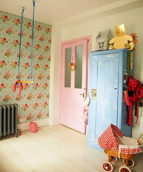
You can either go in a vintage direction, like these images,
which I think can work extremely well in children's bedrooms.
Sturdy, brash and practical....
with blocks of colours...
and funky retro patterns...
Or, if you love a bold look, then why not embrace it with
bright for bright's sake...
Look at this gorgeous wall-paper.
Not my cup of tea but I bet any little girl would adore
staring at it as she fell asleep each night...
And, woooooah,
that's not what I'd call a restful children's bedroom,
but it's certainly attention-grabbing...
And lastly, as you might have guessed, my favourite:
subtle with a pop of bright.
Not too overwhelming, easy on the eye, not too kitsch.
I do love the look of this room....
but it seems a bit impractical with that spindly light
and lack of storage.
Am I being too picky?
Now, let me have it...which is your favourite?
Images: 1st Option, Despues, A Paddington Perspective, Bloesem Kids, House To Home


0 comments:
Post a Comment